Sisters and Brothers
I’m going to let you in on something.
In the dark times, I too, worked in the print industry.

I say this because I’ve found almost universally, traditional print designers seem to have a hard time transitioning to the web.
I think the root cause of this is either an inability, or unwillingness to wholeheartedly embrace their new medium.
Somehow I managed to escape this fate.
Possibly what saved me is I was never a great designer, but also because I carried with me many skills and tricks I still use to this day.
Things like doing the math in my head for throwing down a grid on a page;

Taking an ad and reworking it for placement in myriad publications, each with different specs and sizing;
But most importantly, doing things by the numbers.
All too often, I would see designers dragging elements around a page, placing them in the abstract, as though their monitor itself was the medium.
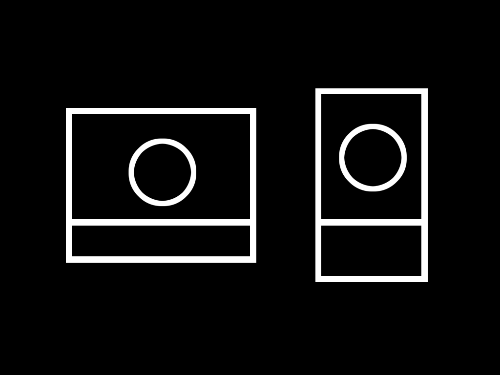
Print is not an abstract media. It has a fixed size. It’s your business to know exactly where things are.
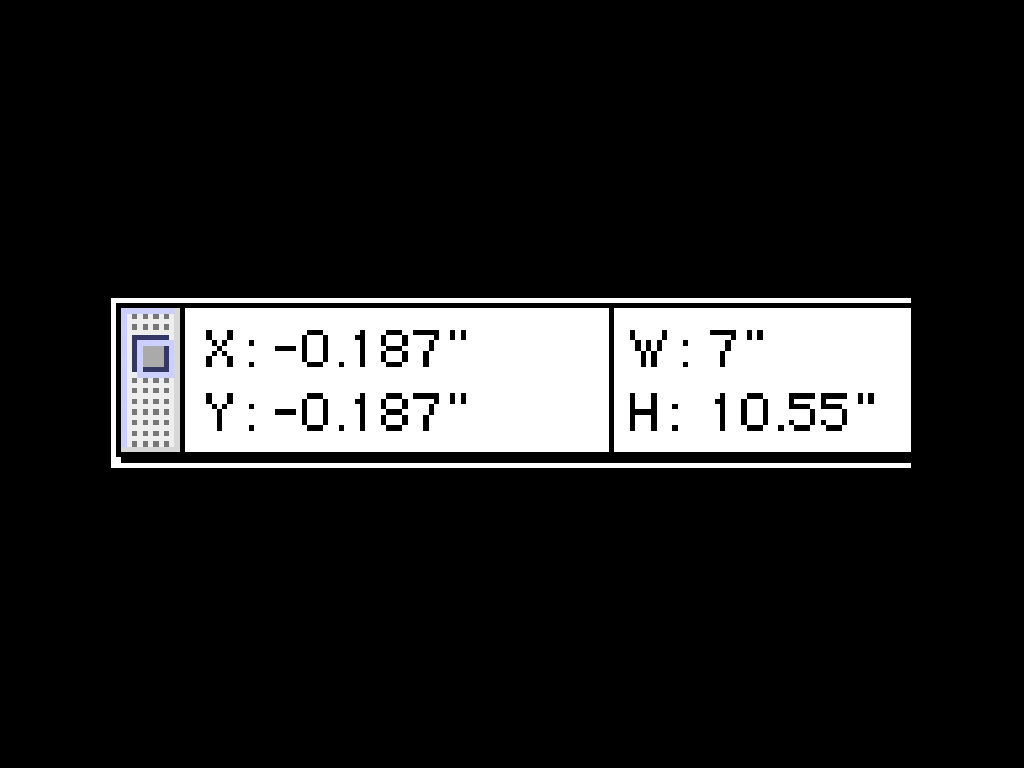
To this end, the Inspector is your best friend, and you should be using numbers to put things in their place.
Design is about relationships between size and position.
In the responsive web era, these relationships are even more important.
However, the fundamentals don’t change. To master your craft, you need to deeply embrace and understand the medium you work in.
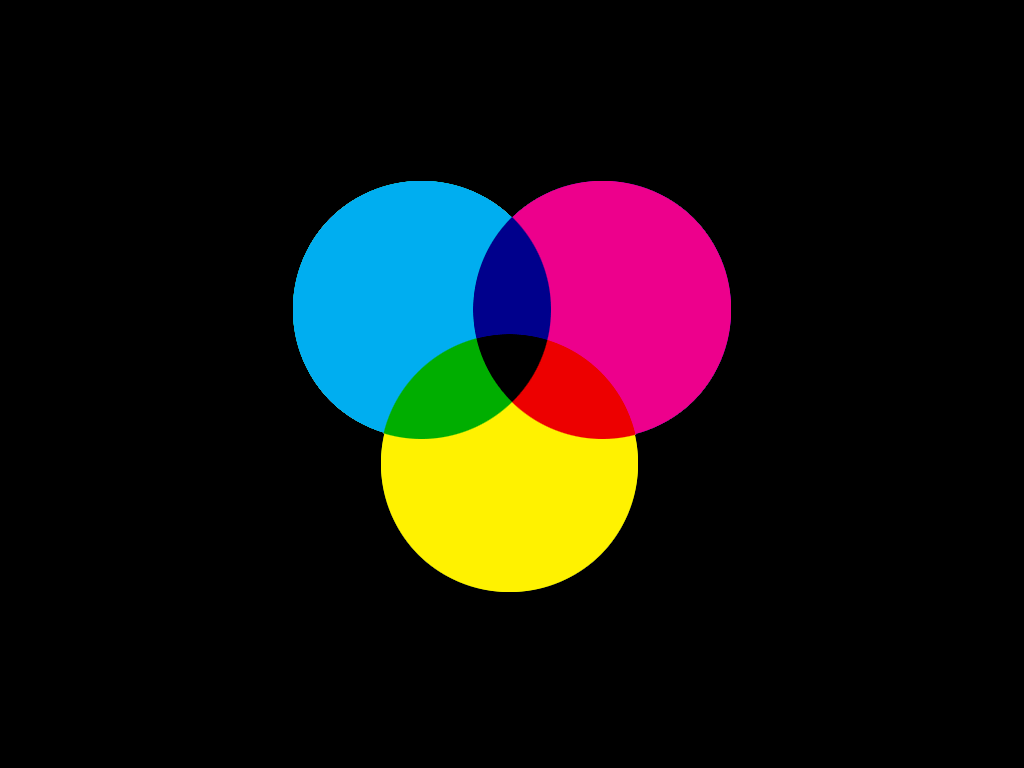
One of the primary differences between print and the web is how colour is created.
The subtractive CYMK of print:
The additive RGB of digital:
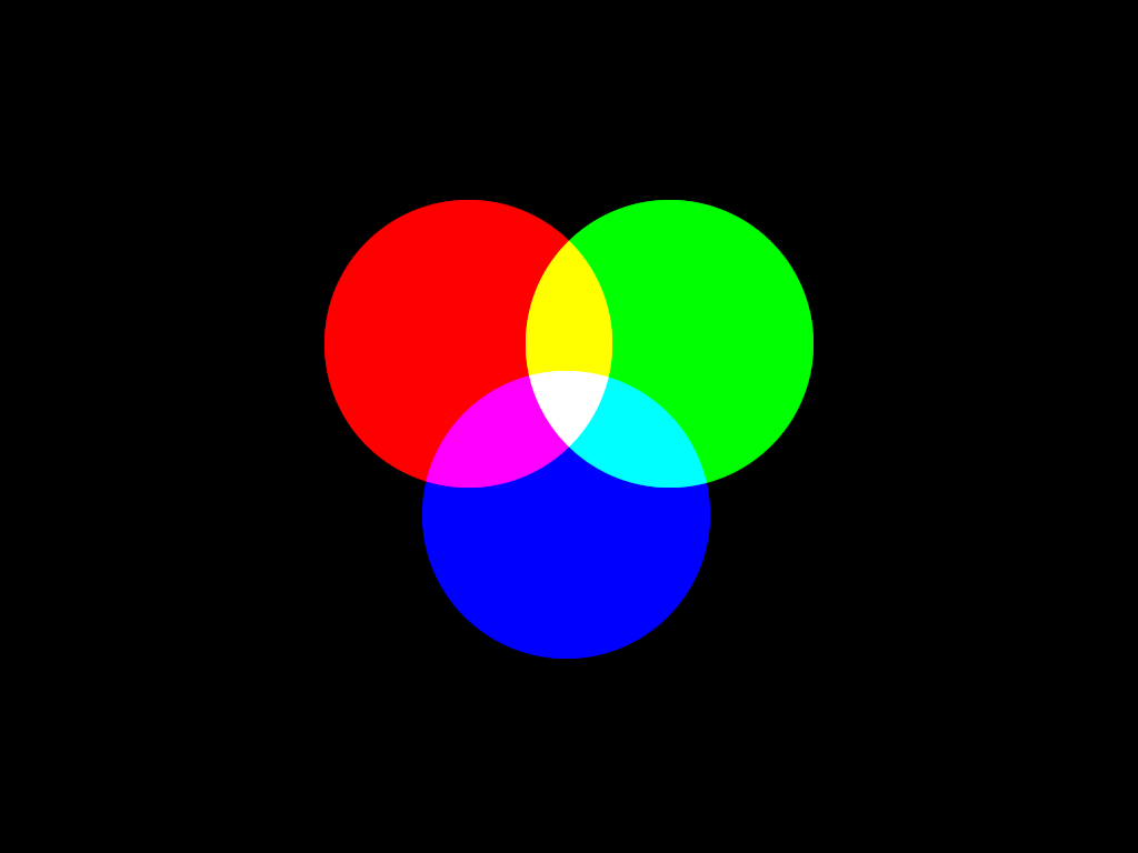
In isolation, any one of these colours is almost useless. You may as well be working in monochrome.
If you will let me make a tenuous connection here:
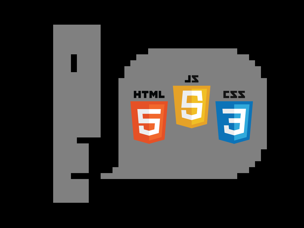
The web has another three components.
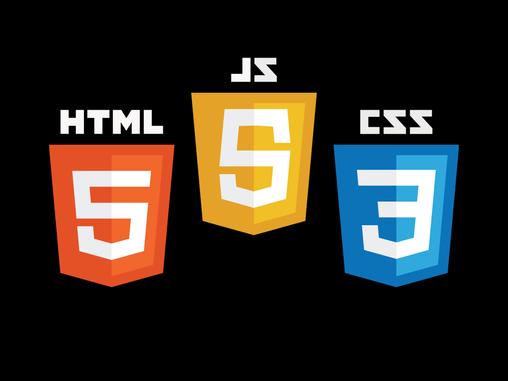
HTML, CSS and JavaScript.
In isolation, any one of these is almost useless.
To truly create for the web, you need an understanding of all three.
If you’re transitioning from print to the web, don’t tell me “It’s too technical”.
Print is incredibly technical. All that’s happened is the complexity has become invisible to you.
I had an epiphany recently. We live in an incredible era.
Finally, after years of struggle, we have web standards that work.
That’s right Sisters and Brothers, HTML, CSS and JavaScript work as advertised.
But it goes one better:
We have an environment called the web browser.
It exists in many shapes and forms, but is ultimately what glues our three technologies together into an almost universal delivery platform.
At it’s heart though, the modern web browser doesn’t simply display things.
It takes interactions from it’s human audience and makes them available for our code to consume.
This is the key point of difference between print and the web.
Modern CSS has a nifty feature called Media Queries. This is one way of dealing with multiple device sizes.
If you know nothing of browser events and scripting, it may seem the Media Query hammer is the only tool on the bench.
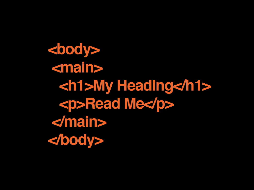
Imagine we have a page of clean and pure HTML...
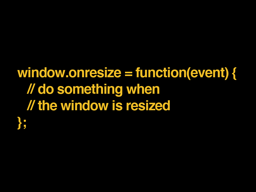
With a little bit of JavaScript, we can ask the browser to tell us every time the window is resized.
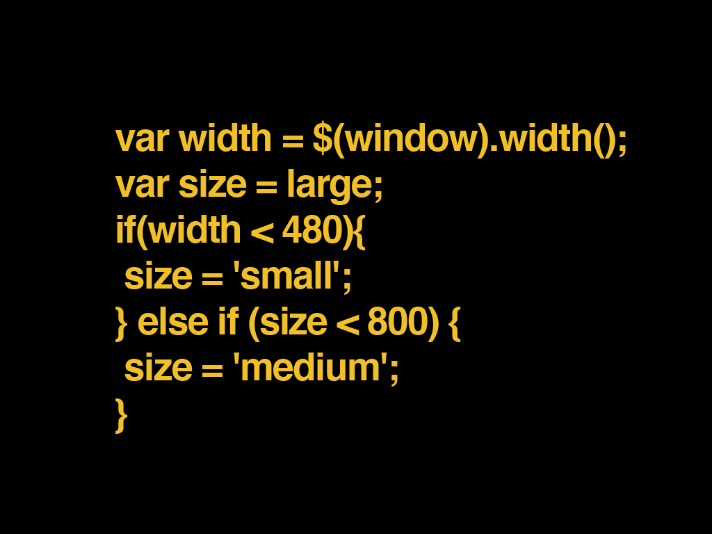
From here, we don’t even have to use any math. Just compare some things to decide what kind of size we are at.
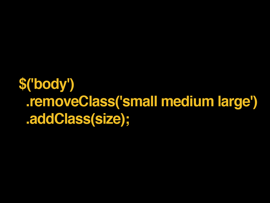
Then apply a class to the body of our HTML.
And our CSS can deal with the size in abstract.
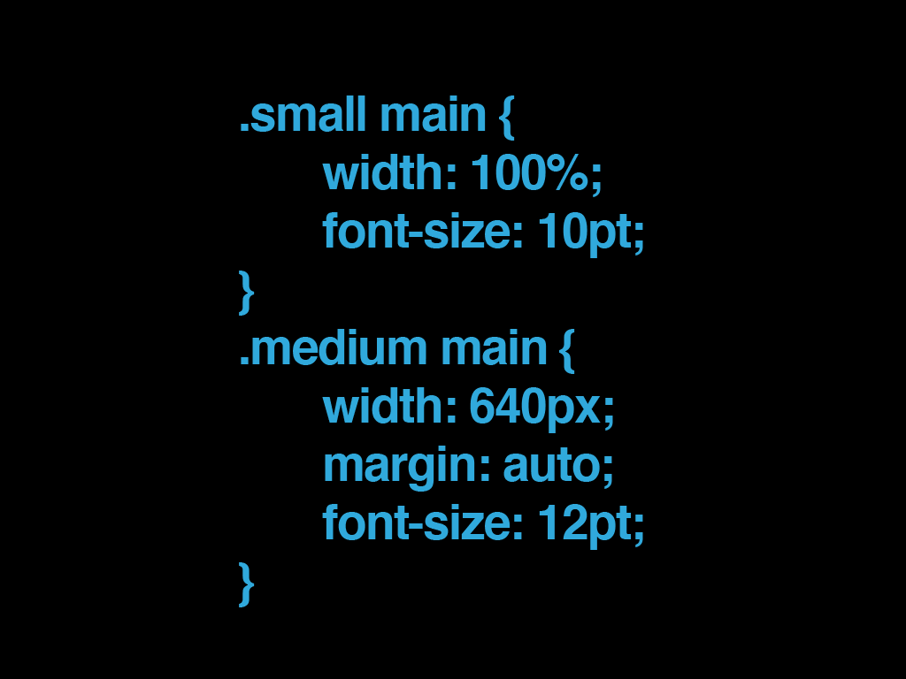
Changing breakpoints is trivial, and all our sizing is contained in a few lines of code.
This is just the very beginning. You can go way beyond this. Once you can control your layout dynamically with scripting, a world of possibilities opens up. Your work becomes many times easier.
The simplest win here is being able to experiment with different sizes by adding or removing one class.
Hook a couple of buttons up to do this and you’ll never have to resize your browser window again.
The key takeaways here are:
We work in an incredibly deep environment.
Don’t sell yourself short by only looking at it from one angle.
Wholeheartedly and honestly embrace the medium for what it is.